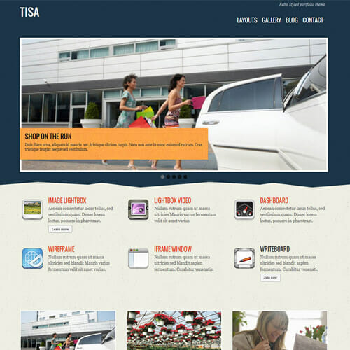
Tisa is the latest addition to our responsive theme collection. What is responsive? Responsive means the design is adaptive to the browser’s viewport. The layout is completely fluid. No matter what device and resolution that your visitor is using, the theme automatically resizes and flow with the viewport. It works on most desktop browsers (Chrome, Firefox, Safari, IE, etc.) and mobile devices such as iPhone, iPad, Blackberry, and Android. To see this in action, view the demo and resize the browser window. If you like responsive layout, you may also like: Elemin, Funki, Minblr, Wumblr, and iTheme2.
Benefit Features of Themify Tisa WordPress Theme
Fluid & Responsive layout (works on desktop and mobile devices such as iPhone, iPad, Android, Blackberry, etc.)
Feature slider
Lightbox gallery (no plugins required)
Product or service highlights
Welcome message
Optional RSS, search form, and social network icons
Header and footer custom menu
Footer text and footer logo
List view and multiple grid view layouts
Choose up to 4 footer widget columns
6 theme skins
Coded with HTML5 & CSS3
Child theme support
> We do not offer any additional services from authors, such as product customization or license keys. We are not affiliated or associated in any way with any third party developers or trademark owners. > This product is intended for testing purposes only. To respect the original developer, we still recommend you to purchase the original product through the official sales site. > 100% Clean Files & Free From Viruses & Free From Malware > Unlimited Use > Instant Download
User Reviews
0.0out of 5
★★★★★
0
★★★★★
0
★★★★★
0
★★★★★
0
★★★★★
0
Write a review
There are no reviews yet.
Be the first to review “Themify Tisa WordPress Theme” Cancel reply






User Reviews
There are no reviews yet.