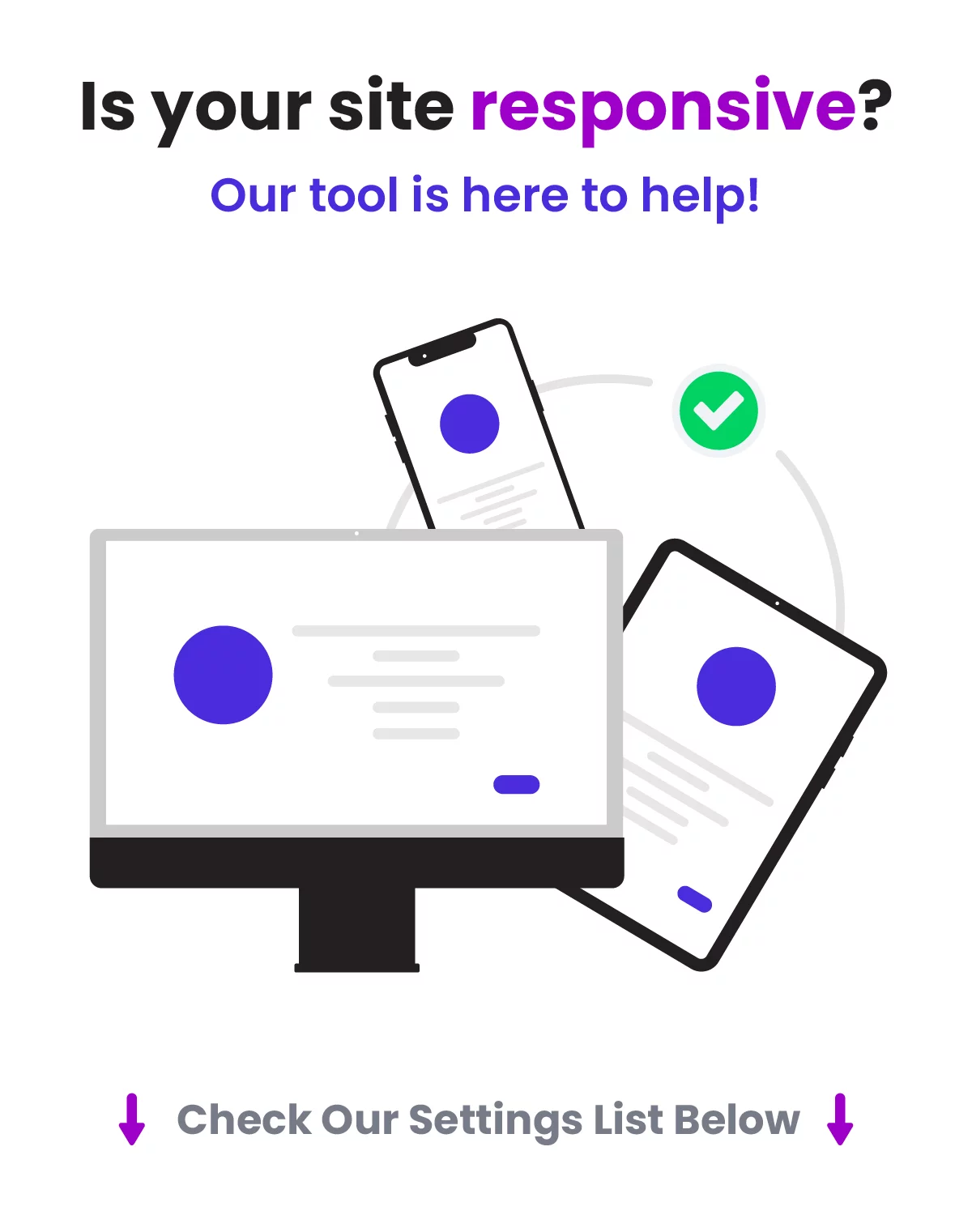
The Divi Responsive Helper is the ultimate Divi responsive toolkit with awesome features and settings to help make your website look great and function well on all devices!
Over (48) Main Features And Counting!
Choose The Number of Row Columns
If you want to have two columns side-by-side on mobile…what do you do? You can’t! But with the Divi Responsive Helper, you can! Our super helpful column number feature allows you to choose the number of columns that stack side-by-side on Desktop and Phone device sizes.
Set Row Column Stacking Order
You no longer have to add crazy code or pull your hair out trying to change the column stacking order. This feature allows you to manually choose the order in which the columns stack on top of each other on Desktop and Phone device sizes.
Choose The Number of Blog Columns
The Divi Blog module uses a default number of columns based on the column width or device size, but has no setting to change it. The Divi Responsive Helper settings allow you to choose the number of blog post columns that stack side-by-side in the Blog module on Desktop, Tablet, and Phone device sizes.
Choose The Number Of Gallery Image Columns
The Divi Gallery module shows four images by default on Desktop, three on Tablet, and one on Phone. There is no setting to change these numbers. The Divi Responsive Helper settings allow you to choose the number of image columns that stack side-by-side in the Gallery module on Desktop, Tablet, and Phone device sizes.
Choose The Number of Portfolio Project Columns
The Divi Portfolio module and Divi Filterable Portfolio module has four columns by default on Desktop, two on Tablet, and one on Phone. But there is no way to change these numbers. The Divi Responsive Helper settings allow you to choose the number of portfolio project columns that stack side-by-side on Desktop, Tablet, and Phone device sizes.
Choose The Number Of Shop WooCommerce Product Columns
The Divi Shop module has four columns by default on Desktop, two on Tablet, and most recently updated to two on Phone as well. This almost always looks terrible, and there are no settings to change it. The Divi Responsive Helper settings allow you to choose the number of WooCommerce product columns that stack side-by-side in the Shop module on Desktop, Tablet, and Phone device sizes.
Choose The Number Of Columns – Woo Related Products Module
The default Woo Related Products module has no column settings, so we have added responsive column layout options!
Choose The Number Of Columns – Woo Cross Sells Module
We added responsive number of columns options to the Woo Cross Sells module!
Choose The Number Of Columns – Woo Product Upsell Module
The default Woo Product Upsell module has no column settings, so we have added responsive column layout options!
Custom Gutter Width
The default gutter width setting in Rows is limited to 1-4, with each number representing a percentage. But what if you want to use pixels or other units? And What if you want a different gutter width value on Desktop, Tablet, and Phone? Until now, it was impossible. But We have added a new feature in the Layout tab of the Divi Theme Options to enable a custom gutter width option in the Divi Builder rows. First, enable the setting in Theme Options. Then in any Row, after turning on the Use Custom Gutter Width setting, you will see our new setting:
Note this custom gutter width feature does not work with any of our custom number of columns features, as this would require a lot of work to make this compatible. It will work for default rows and columns and also in Specialty Sections.
Automatically Solve Widow Words On The Last Line Of Text
Are you getting annoyed by those pesky single words at the end of a heading or paragraph that sit on their own line? This happens a lot on Divi sites, especially on mobile, and many users don’t even realize it. Many Divi users find themselves trying all kinds of tricks to eliminate these widows, including soft-returns, resizing text, or CSS methods that simply don’t work.
The Divi Responsive Helper makes this easy with a real solution that prevents widows throughout your website. The plugin checks your paragraph and heading text to see how many words are on the last line at any screen size and automatically forces the words to match the desired setting that you choose.
Preview How Your Site Will Look On Any Device Size Directly In The Builder
The Divi Responsive Helper plugin adds custom preview sizes directly in the Divi Visual Builder. The new set of options allows you to quickly choose one of the customizable presets, or enter custom value. Take advantage of the full power of the three default responsive breakpoints in Divi by using our instant, customizable preview size, enabling you to make your Divi website responsive down to the pixel!
Completely Disable The Built-In Divi Responsive Views Feature
You probably know by now that Divi released their own built-in preview size feature after our plugin became popular. However, the new feature is limited and frustrating. Because of these limitations and frustrations, we created a setting in the Divi Responsive Helper to completely disable this Divi feature and use ours instead!
Quickly Set Global Sitewide Text Sizes For Desktop, Tablet, And Phone
The Divi Responsive Helper gives you input fields in the Divi Theme Options to set each of your heading (H1-H6) and paragraph (text, body text, etc) text on each device. Every module on your website will now have consistent text sizes and it only takes a few minutes to set up! You can use whatever value you prefer, like px, em, rem, etc! And the best part is that you can override any of these settings at any time in any of the module settings!
Convenient Custom CSS Media Queries Code Boxes
Divi comes with only one main Custom CSS input area, but if you want your CSS to only apply on certain device sizes you would need to specifically write your own custom media queries. This can be difficult and intimidating, especially for beginners. The Divi Responsive Helper plugin provides you with several new custom CSS input boxes that correspond to all of the built in Divi breakpoint sizes.
Totally Custom CSS Media Queries For Any Device Size
You can now create your own media queries! Simply enter a min-width and max-width value into the settings, and write or paste any CSS code into the box. Any code in the box will apply on your website between those custom sizes! No need to mess around with writing your own media queries anymore!
Responsive Settings For Post Count Per Device
The Divi Blog, Gallery, Portfolio, and Woo Products modules have a setting to enter the desired number of items to show. However, this is very limited because it does not have responsive settings, meaning the number of items that looks good on desktop will get super long on phones, and this is not a good user experience. It would be great to have responsive options for this, which is exactly what our plugin provides!
The Divi Responsive Helper plugin includes a responsive icon and tabs inside the existing Blog, Gallery, Portfolio, Filterable Portfolio, and Woo Products modules which allows you to enter the number of items you want to display on Desktop, Tablet, and Phone devices.
Show Hamburger Menu On Desktop
This feature allows you choose to show a hamburger menu icon on desktop, just like what you see on Phone devices. There are many use cases for this, and it’s nice to have this as a simple setting.
Opened/Closed Icon Picker For Menu Module
Choose which icons you want to use for both the opened and closed hamburger menu icons. The icon picker allows you to choose any icon included with Divi.
Show Text Beside Hamburger Menu Icon
Enable this feature to show a word or text to the left side the of the hamburger menu icon. This gives the visitor a visual indication or prompt to make it clear that it is the menu.
Show An Open Menu On Mobile
Sometimes you want to remove the hamburger menu icon and open the menu instead on Phone devices. There are many use cases for this, and it’s nice to have this as a simple setting. Enabling the setting in Theme Options activates an additional setting in the Menu module for showing an open menu instead of a hamburger menu.
Collapse Mobile Menu Submenus
This feature allows you to collapse the submenus rather than keep them open, which is the default behavior. This really helps tidy up the menu and makes it much shorter as well.
Collapse Submenu When Another Is Opened
We added another setting related to the menu and collapsing submenus. Now, you can enable an additional setting that closes any opened submenu as soon as you open another submenu. This way, there is only one submenu open at one time.
Open/Close Submenus By Clicking Parent Menu Item
This next new setting takes it a step further. After the submenus are collapsed, you can also choose to open and close the submenu by clicking the parent menu item. So for this, just keep in mind that it effectively disables the parent menu link. The parent link becomes the clicking point to open or close the submenu, just like the icon.
Mobile Menu Breakpoint
Enter the screen width pixel value for the responsive breakpoint for when the menu changes between desktop and mobile versions. This is helpful especially when you have a larger number of menu items that start to overlap due to space issues. Increasing the breakpoint higher than the default 981px allows the hamburger menu to appear on larger device sizes to prevent the ugly and unprofessional stacking issue.
Choose Navigation Menu Per Device In Menu Module
The Divi Menu module is limited because it only allows you to select one WordPress navigation menu, and that menu shows on all devices. So we hacked the Divi Menu module and added responsive settings to the menu selection dropdown! Now you can choose a completely different navigation menu to show on Desktop, Tablet, and Phone!
Show/Hide Menu Items Per Device
WordPress navigation menus do not have any way to control which items show on which device. This Divi Responsive Helper feature allows you to control which menu items to show or hide on Desktop, Tablet, or Phone. Once enabled, each menu item in Appearance>Menus will have checkmark boxes which allow you to choose on which device sizes you want that particular menu item to be visible.
Automatically Open The Desktop, Tablet, And Phone Tabs
Use the Divi Responsive Helper to automatically toggle open the three responsive tabs for Desktop, Tablet, and Phone in the Divi Builder. This annoying task is made easy with a switch of a toggle! Now when you are ready to make your site responsive you can adjust the Divi settings for each device without clicking to open the tabs for every setting!
Change The Blurb Image/Icon Position On Phone
When you use a Blurb module with an icon or image on the left, the mobile version gets really awkward with spacing. The title and text get really narrow, and this looks very unprofessional. To remedy this, some would say to duplicate the module and adjust the visibility settings, but that is not recommended at all. The easier solution is to use our setting in the Design tab of the Divi Blurb module to move the icon or image to the top on mobile, but keep the desktop version the same. Much better!
Tabs Module Tab Layout
By default, the tabs in the Divi Tabs module are horizontal on Tablet and only stack vertically on Phone. But what if you want them to stack vertically on Tablet, or maintain a horizontal layout on Phone? With the Divi Responsive Helper plugin, you now have the options in the Design tab of the Divi Tabs module to stack the tabs vertically on Tablet, and horizontally on Phone.
Default Layout Settings
These settings allow you to easily set the defaults for the entire website. These new settings in Theme Options correspond to those found in the Customizer, and each location updates when you change the other. It is important to note which settings use percentage units and which ones use pixel units. The Divi Customizer uses a percentage value for the top and bottom padding on Desktop, and a pixel value for the top and bottom padding on Tablet and Phone. Also note that these global settings are default, but can be overridden by adjusting the settings in any section/row.
Section Default Top/Bottom Padding
These three settings allow you to easily set the default top and bottom padding on Desktop, Tablet, and Phone for all the sections on your website.
Row Default Top/Bottom Padding
These three settings allow you to easily set the default top and bottom padding on Desktop, Tablet, and Phone for all the rows on your website.
Set The Row Default Width
These three settings allow you to easily set the default width on Desktop, Tablet, and Phone for all the rows on your website. The new settings in Theme Options correspond to those found in the Divi Builder in the Row settings in the Design tab in the Sizing toggle. Note that Divi uses percentage units by default. Also note that each of these global settings can be overridden by adjusting the width setting in any row.
Row Default Max Width
These three settings allow you to easily set the default max width on Desktop, Tablet, and Phone for all the rows on your website. The new settings in Theme Options correspond to those found in the Divi Builder in the Row settings in the Design tab in the Sizing toggle. Note that Divi uses pixel units by default. Also note that each of these global settings can be overridden by adjusting the max width setting in any row.
Miscellaneous Settings
The Divi Responsive Helper plugin includes several features that are very helpful by themselves, but do not fit into any of the bigger categories. The purpose of these features is to make it easier for you to make your Divi website responsive.
Enable Parallax Effect On Mobile
Divi has a parallax background effect feature within any section, row, column, or module. However, the built-in feature only works on Desktop! The Divi Responsive Helper plugin solves that limitation and applies it to all devices. Once you enable the feature, it automatically adds support for the parallax effect on mobile devices whenever the Use Parallax Effect setting is enabled.
Disable Hover Effects On Touch Devices
Hover effects do not work well on devices without a mouse, and this has always been an issue in Divi. Now with our new toggle, you can simply disable any hover effects added in Divi modules on devices that are touchscreens. So now hover effects will not awkwardly appear after touching something on tablets and phone.
Disable Animations On Mobile
The Divi animation effects do not have responsive settings to change them or turn them off per device, so we included this feature to disable animations on mobile. Usually, animations increase the website load time and are sometimes annoying to view on a phone, so we hope this allows you to improve site performance and user experience.
Prevent Horizontal Scroll
Enable this feature to prevent a common issue with Divi which causes the mobile site to scroll sideways with a horizontal scroll bar. Many Divi websites have this problem and it often goes unnoticed, so we recommend using this on all your sites.
Mobile Pinch Zooming
Enable this feature to allow users to pinch and zoom on mobile. By default, Divi does not allow you to do this. This can be really helpful for visitors who are struggling to read text or to click links, or who may need to enlarge the screen to see images, charts, etc.
Different Mobile Logo
This feature allows you to set a different logo image to appear in the default header menu on tablet and phone devices. This is great if you need your logo to have a different size or shape for desktop and mobile. (Keep in mind this is for the default header, not the Menu module since that module already has this ability.)
Mobile Header Bar Color
Set a color for the mobile address bar header for Android devices using the Chrome browser. This is a really nice effect to add that extra touch of branding and personalization.
Back To Top Button Visibility
Choose on which devices to show the Back To Top Button. This feature first requires the main Back To Top Button to be enabled in Divi>Theme Options>General. This feature is very handy and practical. For example, if your layouts are fairly short on desktop and the button is not needed, the layout may get really long on mobile when all the content is stacked. This would cause the user to need to scroll and scroll just to get back to the top. In this use case, you may want to only show the Back To Top Button on Phone.
Ease The Pain. Enjoy The Benefits!
Very Simple To Use
We have integrated the features of this plugin beautifully into the normal Divi environment, including the Divi Theme Options and within all the Sections, Rows, Columns, and Modules. Easily enable or disable the individual features!
A Remarkable Time Saver
The Divi Responsive Helper was created to save time and improve efficiency. Spend less time opening and closing responsive settings and closing the builder constantly to test the responsive screen sizes in the browser tools. Instead of confusion and hassle, spend more time being creative with your design layouts and getting stuff done!
Avoid Costly Mistakes
The default Divi responsive settings are cumbersome, awkward, and very limited. Worst of all, this can lead to embarrassing mistakes with long-term revenue loss. For example, a poorly designed mobile experience leads to much less search engine visibility which means fewer visitors and ultimately less money in your pocket. Our solutions clear up the confusion so you can edit your Divi websites to perfection.
> We do not offer any additional services from authors, such as product customization or license keys. We are not affiliated or associated in any way with any third party developers or trademark owners. > This product is intended for testing purposes only. To respect the original developer, we still recommend you to purchase the original product through the official sales site. > 100% Clean Files & Free From Viruses & Free From Malware > Unlimited Use > Instant Download
User Reviews
0.0out of 5
★★★★★
0
★★★★★
0
★★★★★
0
★★★★★
0
★★★★★
0
Write a review
There are no reviews yet.
Be the first to review “Divi Responsive Helper” Cancel reply


User Reviews
There are no reviews yet.