Add to wishlist0
Add to compare
Free!
Sold by
Garudeya
- Description
- Disclaimer
- Reviews
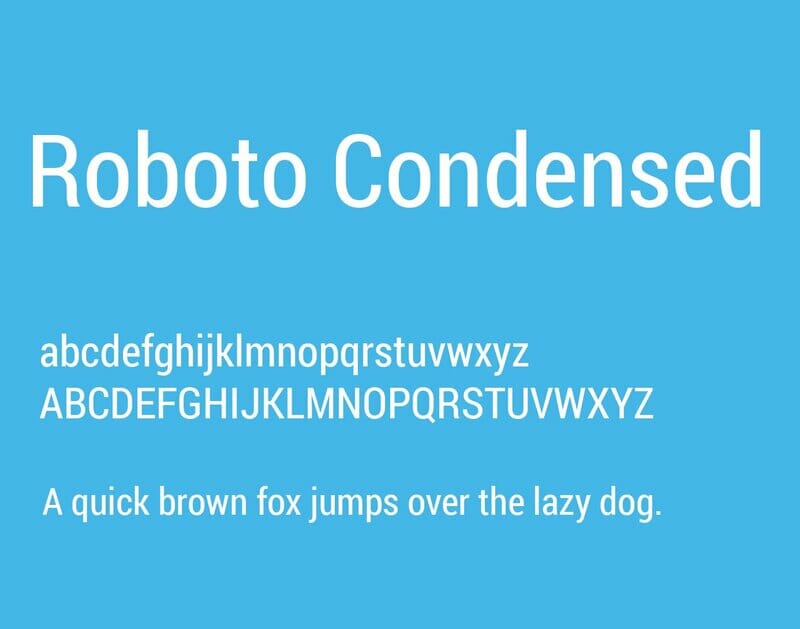
About Roboto Condensed
Roboto has a dual nature. It has a mechanical skeleton and the forms are largely geometric. At the same time, the font features friendly and open curves. While some grotesks distort their letterforms to force a rigid rhythm, Roboto doesn’t compromise, allowing letters to be settled into their natural width. This makes for a more natural reading rhythm more commonly found in humanist and serif types.
This is the Condensed family, which can be used alongside the normal Roboto family and the Roboto Slab family.
We do not offer any additional services of the author, such as customization of products or license keys. We are not affiliated with or related in any way to third-party developers or trademark owners.
> 100% Clean Files & Free From Viruses & Free From Malware
> Unlimited Domain Usage
> Instant Download
> 100% Clean Files & Free From Viruses & Free From Malware
> Unlimited Domain Usage
> Instant Download
Other People Also Viewed
Added to wishlistRemoved from wishlist 0
Free!
Added to wishlistRemoved from wishlist 0
Free!
Added to wishlistRemoved from wishlist 0
Free!
Added to wishlistRemoved from wishlist 0
Free!



User Reviews
There are no reviews yet.