Free!
Garudeya
- Description
- Disclaimer
- Reviews
Roboto Font: Elevate Your Digital Presence with Modern Elegance
In today’s fast-paced digital landscape, the way your content is presented speaks volumes about your brand’s identity and professionalism. Typography plays a pivotal role in this presentation, influencing not just aesthetics but also readability and user engagement. Enter the Roboto Font, a typeface that seamlessly marries modern design with functional excellence, offering a solution to the perennial challenge of choosing the perfect font for your digital endeavors.
Imagine a typeface that not only complements your content but enhances it, making every word resonate with clarity and purpose. Roboto is designed to be that typeface, addressing the core desires of designers and content creators: versatility, readability, and a contemporary appeal. Whether you’re crafting a mobile application, designing a website, or developing a brand identity, Roboto provides the typographic foundation that ensures your message is both impactful and accessible.
Key Features and Benefits of Roboto Font
1. Modern and Clean Design
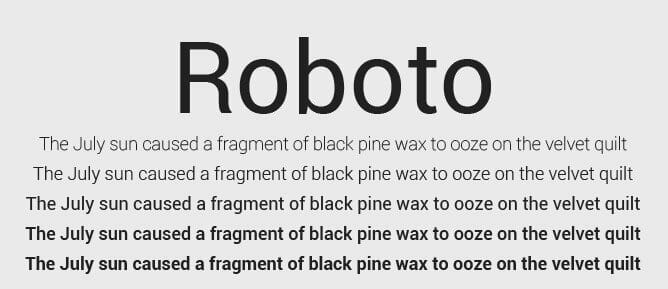
Roboto is a sans-serif typeface characterized by its clean lines and minimalist aesthetic. Its geometric shapes, combined with slightly rounded details, impart a friendly and approachable feel, making it suitable for a wide range of applications. This balance between precision and warmth ensures that your content appears both professional and engaging.
2. Versatility Across Platforms
Originally developed by Google for the Android operating system, Roboto has transcended its initial purpose to become a ubiquitous choice across various platforms. Its adaptability makes it ideal for both digital interfaces and print media, ensuring consistency in branding and communication.
3. Extensive Font Family
The Roboto font family offers a comprehensive range of weights and styles, including Thin, Light, Regular, Medium, Bold, and Black, each with corresponding italics. This extensive selection allows designers to establish clear visual hierarchies and tailor typography to specific design needs, enhancing both aesthetics and functionality.
4. Enhanced Readability
One of Roboto’s standout features is its tall x-height, which significantly improves legibility, especially on digital screens. The open curves and natural letter widths contribute to a smooth reading experience, reducing eye strain and ensuring that your audience can engage with your content effortlessly.
5. Open Source Accessibility
Roboto is available under the Apache License, meaning it’s free to use for both personal and commercial projects. This open-source accessibility empowers designers and developers to integrate Roboto into their work without licensing constraints, fostering creativity and innovation.
6. Global Language Support
Supporting a wide array of languages, including Latin, Greek (partial), and Cyrillic scripts, Roboto ensures that your content can reach a global audience without compromising on typographic consistency. This extensive language support makes it a preferred choice for international projects and multicultural communications.
7. Continuous Evolution
Since its introduction, Roboto has undergone several updates to refine its appearance and functionality. These updates reflect a commitment to staying current with design trends and technological advancements, ensuring that Roboto remains a relevant and reliable typeface for contemporary design needs.
Embrace the Roboto Advantage
Incorporating Roboto into your design projects means choosing a typeface that is both timeless and forward-thinking. Its harmonious blend of modern aesthetics and practical functionality addresses the core challenges faced by designers and content creators, providing a reliable solution that enhances user experience and elevates brand perception.
With Roboto, you’re not just selecting a font; you’re embracing a design philosophy that values clarity, versatility, and inclusivity. Transform your digital presence and connect with your audience more effectively by integrating Roboto into your typographic repertoire.
How to Download this item at Garudeya.com
The method is quite easy, click this link, you will be directed to this item download tutorial
> 100% Clean Files & Free From Viruses & Free From Malware
> Unlimited Domain Usage
> Instant Download
