Add to wishlist0
Add to compare
Free!
Sold by
Garudeya
- Description
- Disclaimer
- Reviews
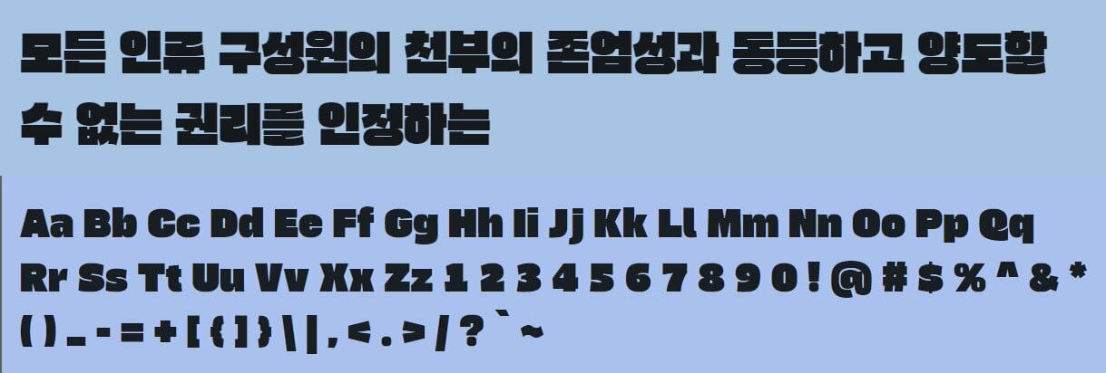
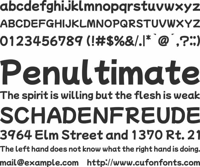
When people mention “Soek” in South Korea, they will think of the Chinese character. This word gives the impression of being as thick and hard as a stone. Ga means “to add” in Korean. So this typeface, Gasoek, is a much thicker typeface than usual typefaces. The thick strokes fill up the embox, but by giving the right angle at the end of stroke to match with Hangeul characteristics, the font has natural counter spaces with good legibility. So, Gasoek is not just a thick font but a font that has a character and gives a unique impression.
We do not offer any additional services of the author,
such as customization of products or license keys.
We are not affiliated with or related in any way to third-party developers or trademark owners.
> 100% Clean Files & Free From Viruses & Free From Malware
> Unlimited Domain Usage
> Instant Download
Other People Also Viewed
Added to wishlistRemoved from wishlist 0
Free!
Added to wishlistRemoved from wishlist 0
Free!
Added to wishlistRemoved from wishlist 0
Free!
Added to wishlistRemoved from wishlist 0
Free!


User Reviews
There are no reviews yet.