Free!
Garudeya
- Description
- Disclaimer
- Reviews
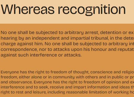
Bricolage Grotesque is a collage of lots of different things: historical sources, technical decisions and personal feelings. It started as a fork of Mayenne Sans, an open-source single weight font designed by Jérémy Landes. It evolved by reinforcing cues from French sources and British sources: the compressed weights lean more towards the anxious and wonky tones of Grotesque Nº9 and the regular weights have a bit more of Antique Olive’s relaxed and confident attitude. The smaller optical sizes become more neutral and reflective of contemporary sans serifs, notably through the use of exaggerated ink traps.
By blending iconic British and French designs with modern trends and tools, it aims to traverse a complex typographical and emotional landscape. At the same time, it’s so steeped in historical sources and references that it’s hard to call it anything but a re-interpretation of the same ideas but for a different purpose: trying to express visually what it feels like to move countries and rebuild, what it feels like to have a hybrid identity where you cannot be what you were and yet you can never truly be anybody else.


User Reviews
There are no reviews yet.